
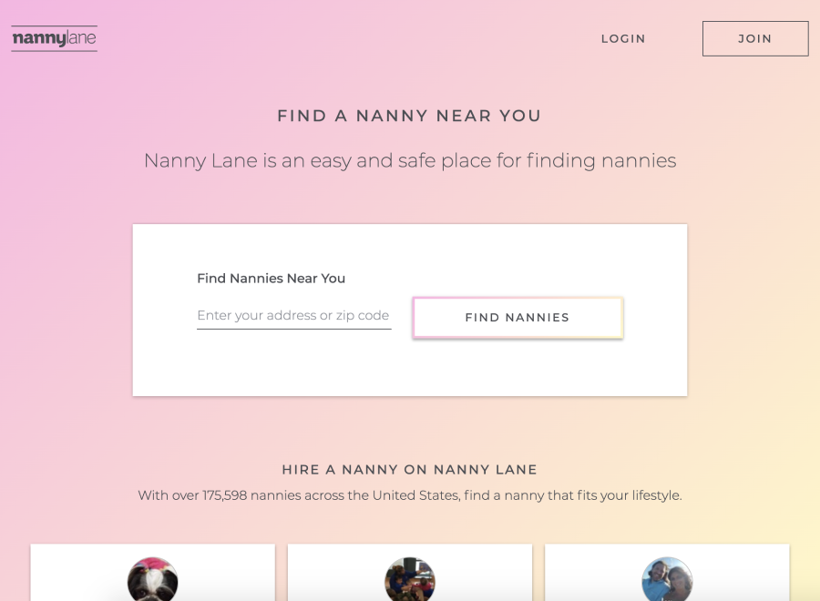
While working on a landing page redesign project for Nanny Lane in Q4 2019, I found that our brand tone of voice wasn't translating appropriately with our existing typography. This challenge brought light to other foundational problems we had with our type system in general regarding contrast, visual hierarchy, and the inability to scale with ease.
In Q1 2020, I set out to improve the way we approached typography by creating a flexible type system, providing detailed documentation, and starting the building blocks for what would become the Nanny Lane Design System.
The existing font weights/sizes made it difficult to scan through pages with no clear distinction between headings and body text.
The use of a light font-weight paired with gradient backgrounds directly impacted readability across various instances.
With clear documentation, we’d ensure consistency between design and production when it comes to the use of typography.
By creating a flexible type system, we’d be able to speed up our product development and design workflow.
Before conducting an audit, I reviewed the existing typography guidelines to outline any areas for improvement in regards to general documentation. In doing so, I was able to plan how I wanted to approach testing a new type system and improving our documentation practice. Below I’ve included the typography guidelines for the Nanny Lane product that I was working with originally.

While designing, I often found myself getting blocked trying to understand our type styles and how to use them. Due to a lack of proper documentation, I’d often have to go back and forth with our engineer to determine the use case for each style. To address these issues, I outlined some key opportunities for improvement.
There was no clear difference between a headline and a title. Since they both behaved like headings, I planned on merging them into one category.
The styles failed to mention how the font sizes responded to different viewport widths. Some fonts stayed the same while others didn't, and so I wanted to make that clear.
The guidelines provided vague explanations on when to use each type style. When writing documentation moving forward, I aimed to provide clear usage explanations.
To ensure consistency, I planned on providing examples for how to go about using the new type styles depending on the type of page they’d be used on.
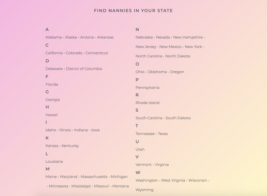
To get a better understanding of how we used the existing type styles across our various pages, I performed an audit collecting examples from 75+ pages in production. In doing so, I found that our pages fell into one of the following five categories: Landing Pages, Directories, Product, Blog, and Miscellaneous.


After reviewing 75+ pages to provide context around our type usage, I came across a pattern of issues that needed to be revisited. Upon further analysis, I concluded that these issues could be resolved through changes to our headings, font weights, typographic hierarchy and contrast. Below are some of the issues I came across during this audit.

The sizes we used for headings and body text lacked differentiation, making it difficult to sift through text.
To improve our typographic hierarchy, I included a larger range of sizes to be used in our type system.

The light font weight we used contrasted poorly against our gray and gradient colours, making it difficult to read.
By replacing the light font weight with a regular weight, we’d make it easier for users to read our content.

Along with all caps text already being difficult to read, we found that it didn’t work well with our brand tone of voice.
We made the decision to remove the use of all caps and replace it with sentence case going forward.


The brand experience was flawed due to the fact that our headings were inconsistent across our pages.
When revisiting these headings, I worked on providing a range of sizes/styles with proper usage guidelines.
With all the preliminary work completed, I was able to put together our new typography guidelines. Within these guidelines was specific information regarding how typography plays a role in portraying the Nanny Lane brand. With documentation that included our typeface, style guides, usage details, do’s and don’ts, and examples, I had set the beginning stages for what could now be a more adaptable and flexible type system.

Initially we had majority of our guidelines in Figma. This became inaccessible for those who weren’t familiar with the software and had to quickly reference things.
To create a single source of truth for my team to access when needed, I moved our documentation to zeroheight which connected directly with our Figma and Storybook libraries.


One of the challenges that came with the existing typography guidelines was a lack of context. Not knowing how the type styles worked responsively, finding many one-off instances and inconsistencies made it difficult to design efficiently.
With these new typography guidelines, I focused on making it easy to contribute as time went on. I can't know exactly where our product will be in the future, but what I can do is provide a flexible way for future employees to adapt these guidelines and add on any examples or details as needed.


When writing the documentation, I really wanted to focus on providing more detailed explanations for how to use our new type styles. Having a solid starting point for new designers or team members to review our usage guidelines would save us time and minimize any initial confusion one might have when starting out at the company.
Headings represent the most important title on the page. They vary in size depending on what page they are being used on. The font-weight is consistent amongst all ranges, but differs in font-size and line-height.
Headings represent the most important title on the page. They vary in size depending on what page they are being used on. The font-weight is consistent amongst all ranges, but differs in font-size and line-height.
Used as the first heading on pages that don’t contain an XLarge heading (ex: directories). This styling can also be used for the <h1> tag when an XLarge heading is not also present on the page.</h1>
Used for titles of sections. You can use a medium heading as a way of dividing a page and making it clear to the user that they are in a new section of the page. This style may or may not use the <h1> or <h3> tag, depending on whether other headings are also present on that same page.</h3></h1>
Sub-headings are smaller than headings and are typically used for medium-emphasis text. Sub-headings can more commonly be found across the entire product. The font-weight is consistent amongst all ranges, but differs in font-size and line-height.
The largest of the two sub-headings. Their use case can vary depending on the page and what text styles are used around it. They are best used on pages that use a Large heading style as their primary heading.
The smallest in the heading category. This sub-heading style is best used when you’re looking to have a subtle differentiation between a title and body text. Since the font sizes are fairly close in size, the font-weight becomes the key differentiator between the sub-heading and body text.
Body text is the base font size for the rest of the type scale, often used for small or large bodies of text. The base font-weight used for body text is “Regular” which contrasts well paired with headings and sub-headings using the “Medium” font-weight.
Used as the most common type style for body content. Often paired with the <p> tag, this style is used for small and large bodies of text.</p>
Used to emphasize/bold specific words, sentences, or phrases in large bodies of text.
Captions are below the base font size and should be used sparingly. They can be used to caption photos, or often times are seen to present error messages under a text field.
Used to caption photos with credits or provide an error message under our text fields.
Petite text is rarely used, and can only be found in our navigation bar for signed in users. This type style is paired with an icon giving further context to what the icon represents. It should only be used if necessary due to its small size being difficult to read.
Paired with icons to give further context as to what the icon represents (ie. "Home" text with an icon of a house)
Transitioning our existing type system in production was going to be an ongoing project. We left the project at this point with the intention of coming back to it to plan how we'd apply these changes in stages overtime.
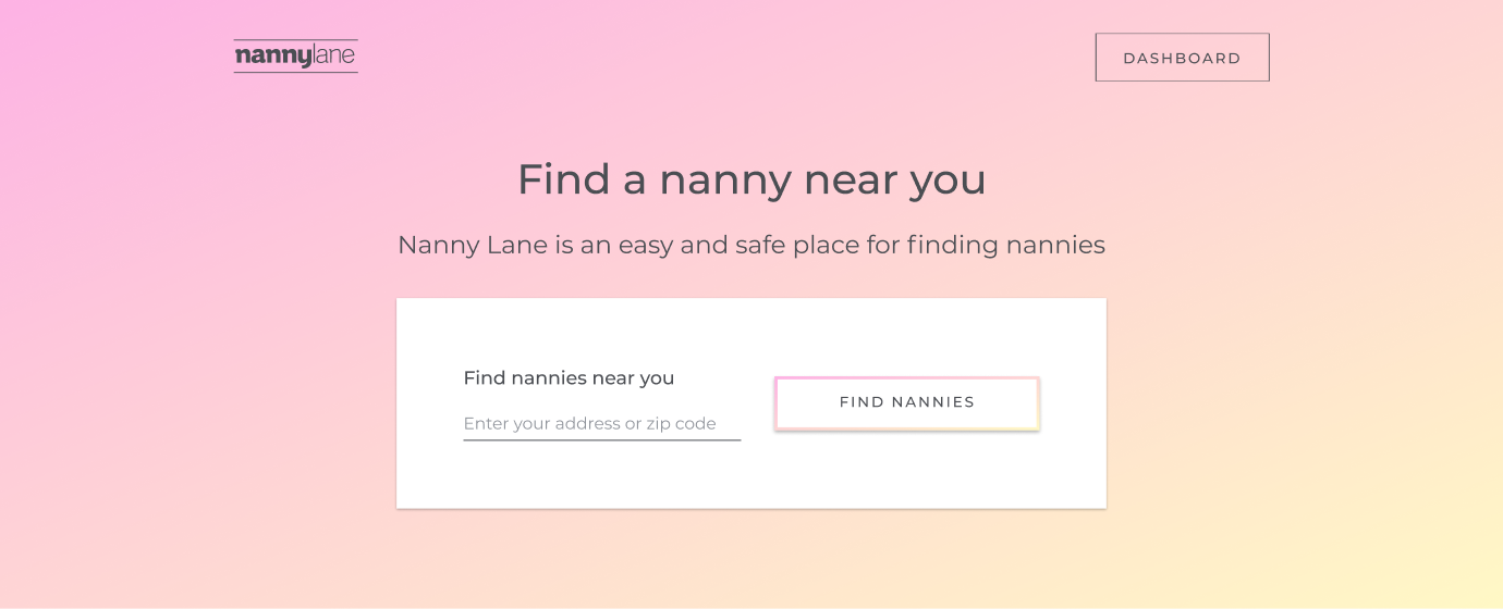
To get a better idea of what the future of the product will look like with these new typography guidelines, I made some mockups comparing the before and after of our most common pages.


I've always found the foundational work that goes into creating a product to be the most interesting part of working as a product designer. While working on this project I gained a stronger understanding of the complexities and opportunities that come from creating some of those initial guidelines (or recreating them in this case). While there was a lot of work done in just three weeks, there were still a lot of unknowns that I wasn't able to address until we applied the new type system in production.
Regardless, where we left off with this project provided a strong foundation for the future of design for Nanny Lane. I'm confident that with the new and improved typography guidelines, whoever picks up where I left off will be able to avoid the issues I came across when I started.
Our product had many pages with varying use cases. I spent majority of my time making sure we had one system that was flexible enough to meet the individual needs of every page, regardless of the type of content present.
Working with gradients as part of your user interface can impact readability on its own. Paired with some other typography issues with hierarchy, contrast, and more, I was content being able to address and fix these issues to improve our users' overall experience with our product.
The work done in this project led to changes in our workflow regarding design and documentation. Without it, we wouldn't started using zeroheight and having discussions around how we can scale our design system moving forward.
Ideally, I would have worked with engineering to build and test different type systems in production before deciding on which one to go with. Due to time constraints, we weren't able to do this simultaneously.
It wasn't until after I performed the type audit that I understood the value of using spreadsheets. It's clear now that I'd be able to work and find similarities/differences between pages faster using spreadsheets.


