
During my time at CareGuide, I was leading the design efforts on the Nanny Lane product. Nanny Lane is a web application that connects caregivers to families seeking long or short term care for their children. Using our tools and resources, families can find caregivers and caregivers can find work with ease.
Nanny Lane has seen exponential growth often through SEO and SEM, finding new users coming from search platforms. We wanted to increase our 11% conversion rate on our main landing pages, so going into Q4 2019 I proposed a redesign of our landing pages to increase conversions, reduce our bounce rate, and effectively sell the Nanny Lane brand.
Shannon (Director of Nanny Lane) took the responsibility of collecting the user research and quantitative data needed to address some of our assumptions. That research led to the creation of our problem statement above which guided our approach to the redesign.
While the research was being done, I focused on evaluating the design of the existing landing pages. Taking a closer look at the visual hierarchy, copywriting, visual layout and more, I was able to get a better idea of where we could make improvements. While doing so, I took some quick notes with ideas, thoughts, and action items to look back on during the ideation phase.
If this is the first thing our users see, how do we best capture their attention?
Is this an accurate representation of what users can expect from signing up?
Are we communicating our services in a way that resonates with our users’ needs/goals?

Is this the best way to define our value? Is this definition clear to our audience?
With this being a fairly new concept, how might we better sell the concept of nanny shares?

If this is the first thing our users see, how do we best capture their attention?

Is this the best way to define our value? Is this definition clear to our audience?

Is this an accurate representation of what users can expect from signing up?

With this being a fairly new concept, how might we better sell the concept of nanny shares?
Are we communicating our services in a way that resonates with our users’ needs/goals?
Although I wasn’t directly responsible for this part of the project, I wanted to include a summary of the conclusions shared from the research conducted by our product manager.
These findings helped us set our problem statement and figure out what to prioritize from a design perspective.
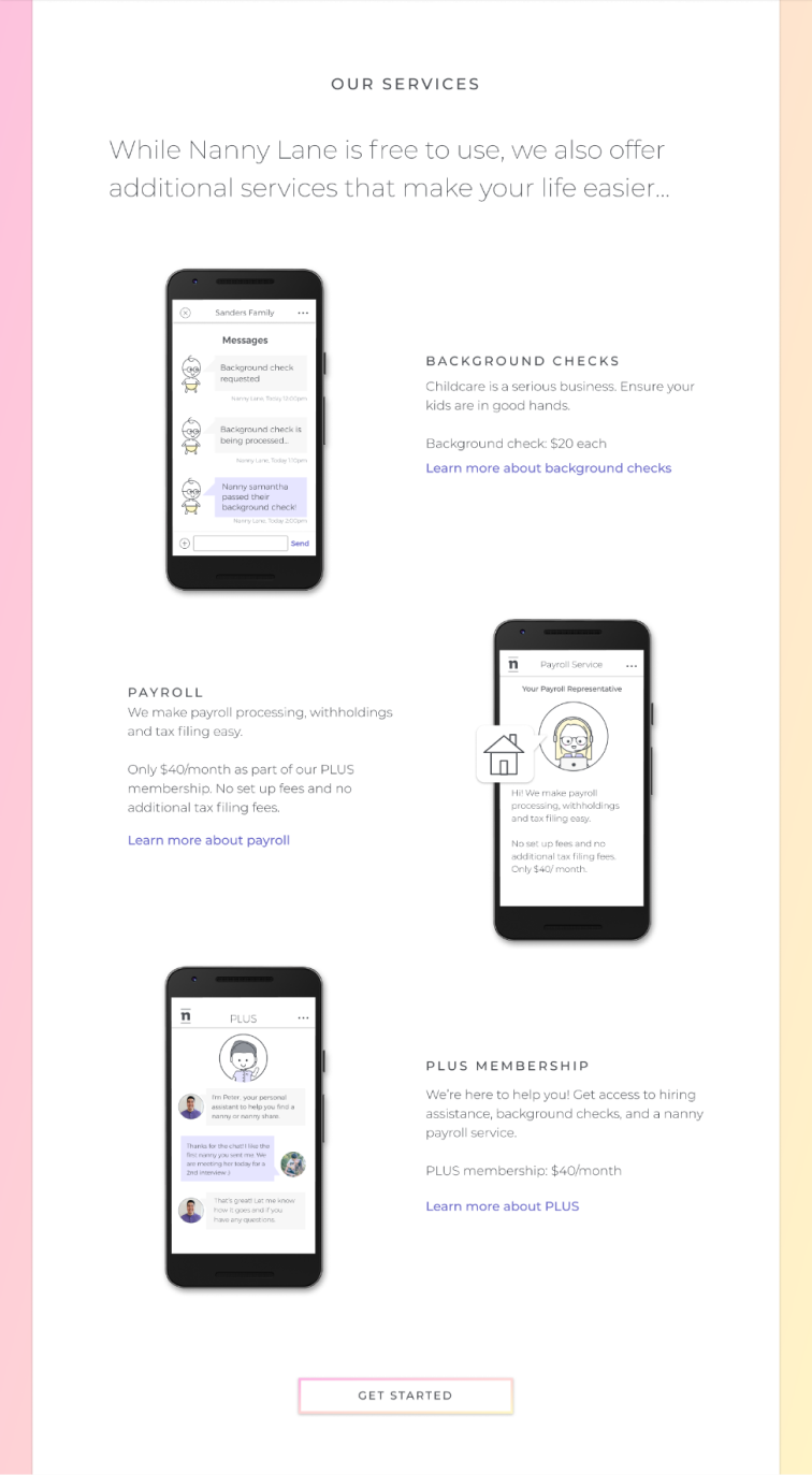
The landing pages don’t portray a sense of security or credibility due to a lack of brand awareness
Our call to actions are confusing, often being clicked but not leading to the acquisition of new users
The services we offer aren’t providing value to potential users, with a majority of them skipping over this section
I started this project by sketching out my ideas on separate pieces of paper and cutting that paper into sections. I wanted to visualize different layout options and figure out what order of sections would feel the most natural.
As a team, we mixed and matched the order of the sketches I provided. We landed on the order displayed here, introducing new sections along with existing ones.

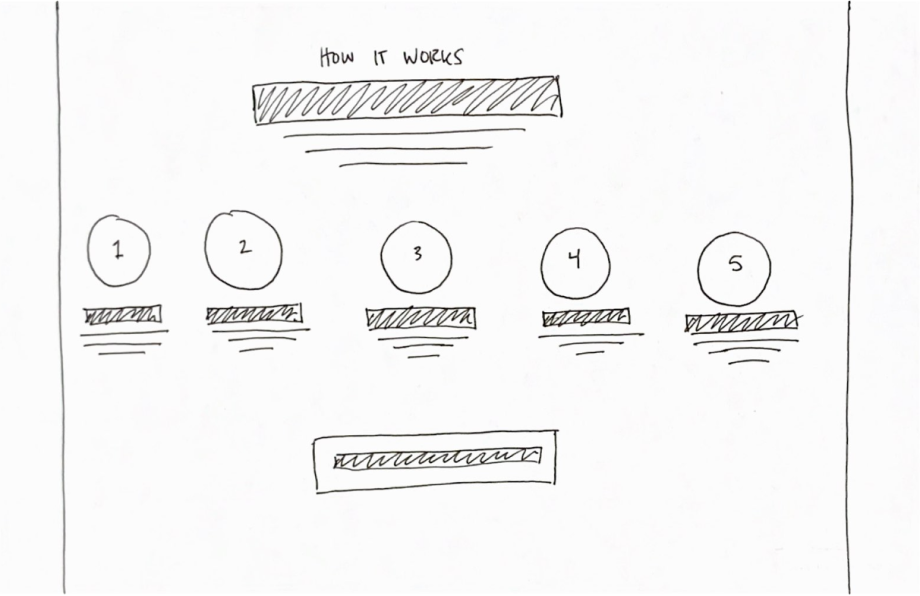


After that mini workshop, I moved forward with low fidelity wireframes. At this point, I was starting to consider how content might change what each section looked like and the order we displayed it in. We often found ourselves jumping between brainstorming content and designing to accurately visualize our ideas.
It was in these brainstorming sessions that I also introduced sections to the page that weren't in the original design:
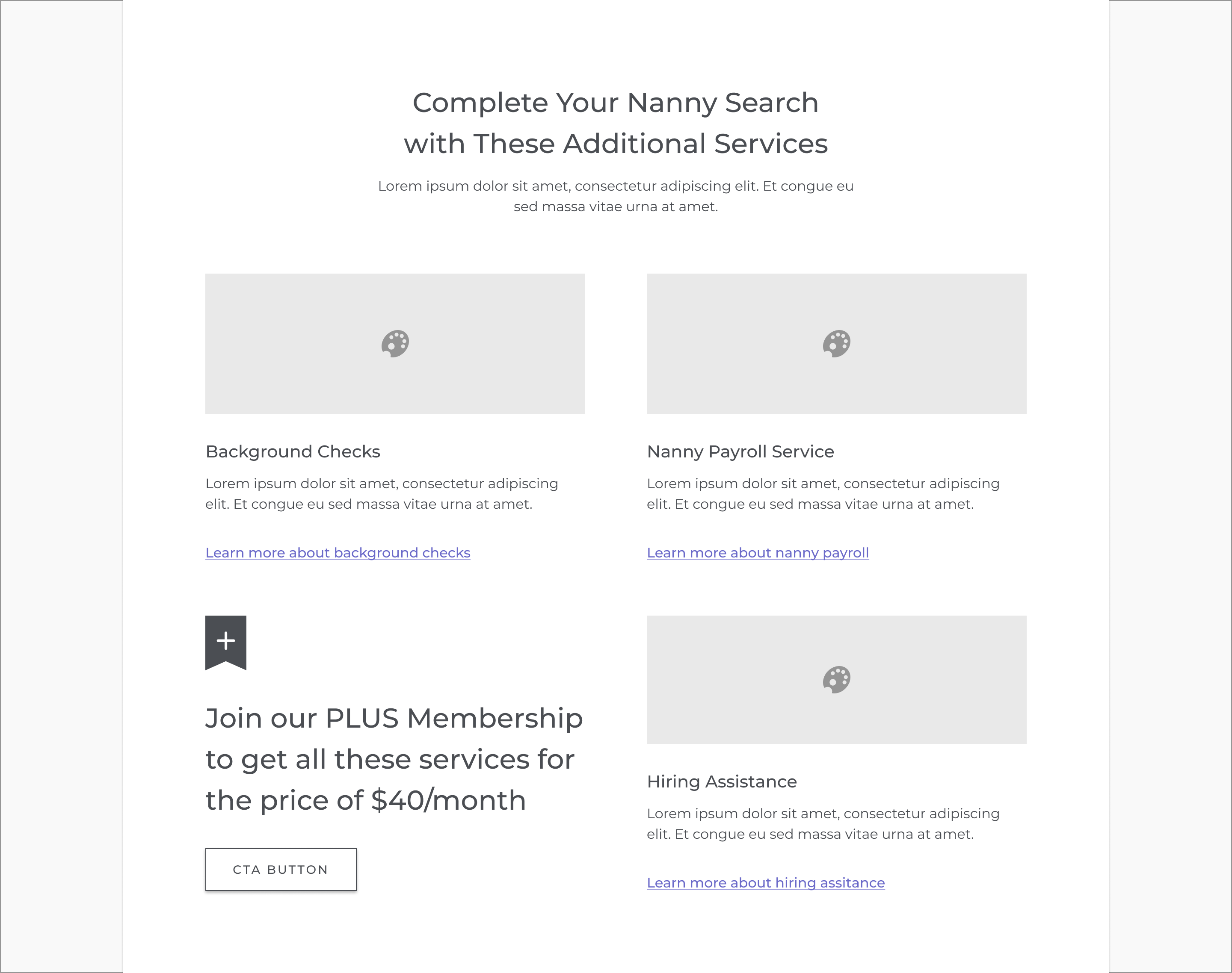
Highlight key benefits and how Nanny Lane can add value to our potential users
Use testimonials to build trust and credibility with those who are undecided
Wrap up the flow of sections with a final call to action
Below you’ll find where we left off with the wireframes before moving into a higher fidelity stage. If you're interested, feel free to look through the previous iterations to see how the design evolved as we went through our feedback sessions.


As the sole product designer, it was my responsibility to make design decisions that not only solved the problem at hand but considered the future of the product. One of our goals with this redesign was to make changes that would allow us to scale the company and product at a faster pace. I knew that the decisions we made for this redesign would serve as the foundation for how we would approach design across the rest of the app.
The landing pages served as the starting point for majority of these changes. Some of the things we wanted to reconsider were how we approached the use of illustrations and images, our brand tone of voice, typography and spacing.
The visuals used on the original landing page relied heavily on selling the product features. With the redesign, I wanted to focus on using illustrations as visual metaphors.
I also incorporated images into the design beyond just the hero section. We found that people were more receptive to seeing photos as they told a story beyond what we could with just words.


The original brand guidelines had outlined that it was important to write in a manner that is clear, concise, accessible, and trustworthy. While the intention was there, the original design focused heavily on being concise which led to a lack of emphasis on the other principles.
So, we spent a lot of time making sure we were consistent with our communication style. We kept to the original guidelines but also wanted to write in a way that would make our audience feel supported.


We experienced some challenges trying to adapt our tone of voice to our existing type styles. Majority of the page used all caps text which didn't translate appropriately with our updated tone of voice. Some major changes were made to how we styled our typography by removing the use of all caps and using a sentence case approach to writing.
This challenge brought light to a much bigger problem we had with our type system in general regarding contrast, visual hierarchy, and more. You can read more about how we approached that problem in this case study.


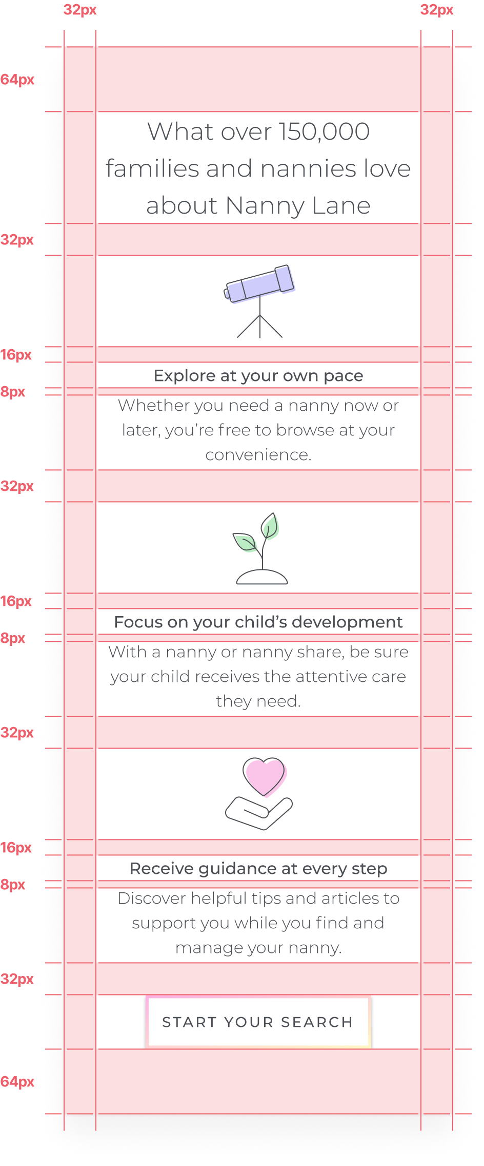
The spacing system that was used in the app consisted of the following pixel values: 4, 8, 16, 32, 64, and 128.
I felt quite limited at first only being able to use a fraction of the values I was used to using. However, I didn't want to fall into a habit of changing things when they didn’t work in my favour. Realistically, I find that behaviour defeats the purpose of systems as a whole.
Instead, I learned to adapt my designs to this system and we found it sped the developer handoff process immensely.
Our plan for launching this redesign was broken up into stages. When this design was completed we were set to hand off and launch the home page by the end of Q4. We discussed A/B testing first but found that we didn't have a large enough user base to do so.
Instead, we launched the main landing page first while I worked on the redesign of the nanny and nanny share landing pages. We planned on evaluating post-launch how successful we were and use our findings to decide how we'd approach launching the other two pages.

The redesign was successfully launched in Q1 2020. Our main objective was to drive continuous Nanny Lane growth. The launch directly aligned with our key result of converting 275 new users, along with our conversion and bounce rate objectives.

The new redesign saw an increase in conversion rate by 16% with 90% of users converting in the hero section.

We hit a record new low for bounce rate with a reduction of 8%, bringing it down to an average of 15-17%.

Our changes also increased average session duration by 7.4%, an unintentional win amongst other successes.
We took a risk not A/B testing some of the new changes we made, but in the end we were happy to see our hard work paid off. The redesign made a huge positive impact on our quarterly objective for new user sign ups, exceeding it well beyond 100%!
The success of this redesign gave the green light for the launch of the other two landing pages. A lot of the UI used on our home page was re-used and adapted to the needs of these pages, making it possible for Roman (Principal Engineer) to develop each of them in just one day!
These other pages were launched closer to when I was no longer at the company, so I didn't get a chance to do a post-launch review of how these pages did in comparison.
This was one of the first major projects I launched during my time at Nanny Lane. I transitioned into my role at Nanny Lane from an internship I completed at eCompliance. During my internship, I was lucky to have an experienced designer to lean on when I wasn't confident making higher level decisions.
Moving into this new role, it was my responsibility to adapt to a new environment with new found responsibilities. This project brought new opportunities for growth, not only as a designer but also as a leader and collaborator.
Taking an idea and seeing it through is no easy task. There were a lot of project management related tasks that I did behind the scenes to guide the team successfully through the project from beginning to end.
Majority of the sections were made to be reused across all pages. By taking a component-based approach to this design, we were able to build and launch our landing pages faster.
Leading a lot of the conversations around copywriting and typography, I was able to help my team understand the importance of content and how it plays an integral role in design.
There were many ideas that we didn’t pursue due to a fear of the unknown. With more time and resources, I would’ve liked to A/B test different solutions to make more informed design decisions.
Being in a small team, it’s hard to be involved in everything. While it wasn’t necessary for me to lead the research process, I believe if I had been more involved I would’ve had a stronger understanding of our users.


